Port Everglades Unleashing the potential of a powerhouse marketing campaign for a powerhouse port
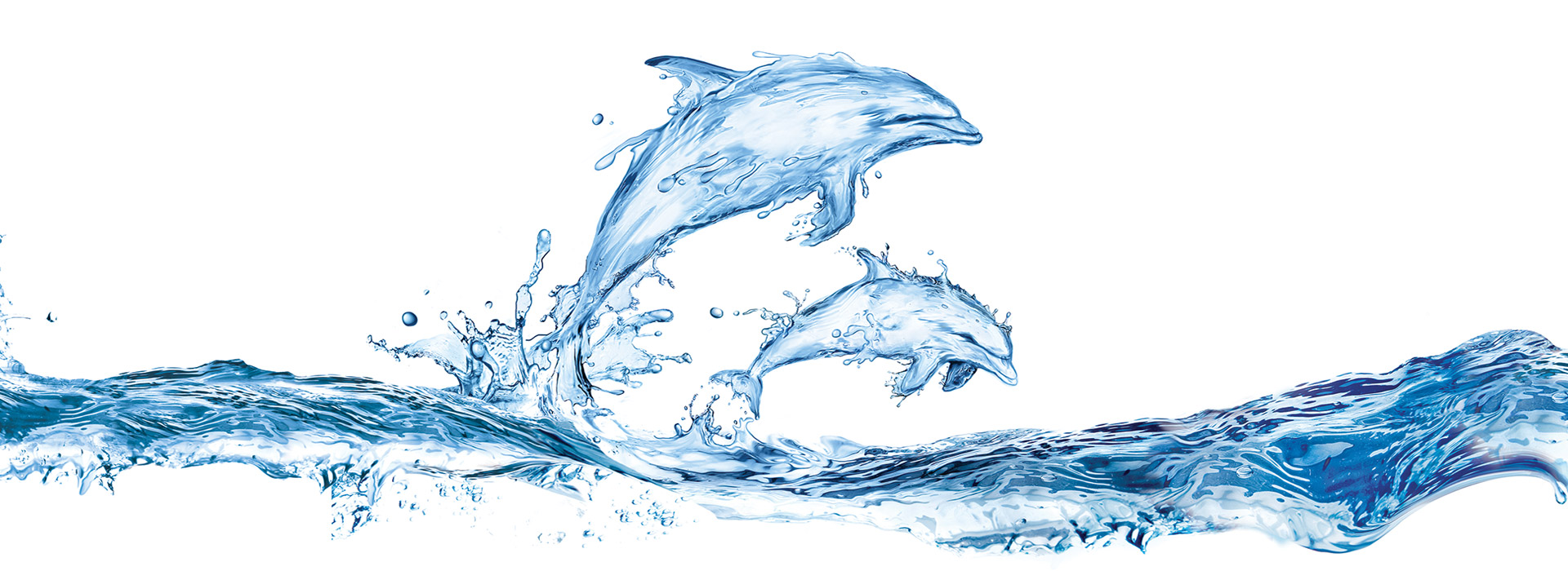
As South Florida’s premier cargo and cruise port, Port Everglades needed a new look and feel to complement their success. So Starmark created iconic “watergraphics” in different shapes that symbolized the port’s messaging.
The launch of this powerful new look was featured in the Port’s Commerce Report. Generating excitement and buzz, the new look of the Report helped Port Everglades build awareness and support for its master expansion plan.
In a literal sea of typical port advertising, the watergraphic look was so refreshing, we created a series of print ads to extend the campaign to the cargo and cruise audiences. New icons were created to represent some of Port Everglades’ most important features.
Starmark launched the “Florida’s Powerhouse Port” campaign, which communicates and differentiates Port Everglades‘ strategy in powerful ways. It features ever-changing water graphics that illustrate attributes of Port Everglades. For example, an alligator illustration made from moving and splashing water, demonstrates strength, speed and power. Dolphins jumping represent speed, friendliness and intelligence.
The Port Everglades campaign differentiates it from its competitors with its unique simplicity and bold graphics. It is integrated throughout Port Everglades’ communications, including; video, digital, print, exhibits and events, collateral and throughout all community messaging.
The American Advertising Federation awarded Starmark and Port Everglades a gold addy for creativity in elements of advertising. Congratulations Port Everglades.


