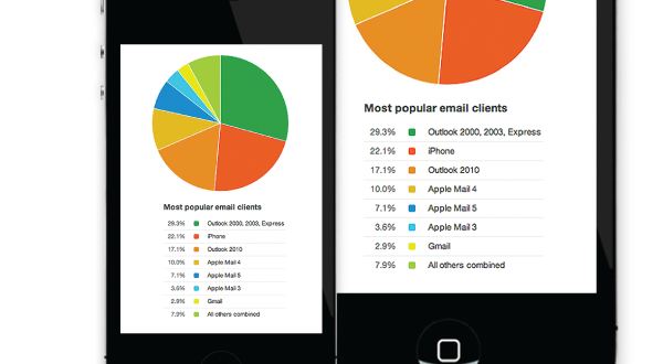
As you know, we’ve covered it before, putting email marketing best practices to work for us in an effort to deliver a compelling message that results in increased open and click-thru rates. However, have you thought about applying that same strategy to viewing your emails on mobile devices? Well, it’s time that you do and here’s why.
Although mobile-email-success statistics don’t get a lot of attention, our internal analytics tells us that 35% of the emails we send on behalf of our clients are opened on iPhone and Android devices. That’s staggering!
Unlike your website, which can detect a mobile device and present a different experience for that device, once an email is built and sent, that’s it! Everyone receives the same HTML file regardless of how they view it.
This is where “responsive design,” sometimes referred to as “fluid design,” comes into play.
What we mean specifically, is that responsive design includes:
- Making sure the underlying page grid scales nicely with different screen resolutions
- Ensuring images work well within that flexible grid
- Using CSS styling tailored to varying resolution and devices
Since all electronic devices from a PC or Mac to an iPhone or tablet receive the exact same set of HTML files, using flexible guidelines can significantly boost readership, and more importantly, click-thru rates from users on mobile devices.
So start being responsive and boost your email response rates today!

